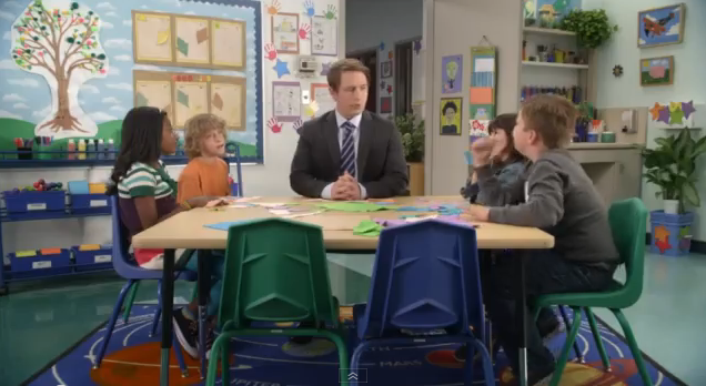
 Jason Potter, Continuity Director for WNWV-FM, Cleveland, writes:
I was just arguing with a co-worker over the effectiveness of a piece of copy. We both agreed that it was creative and good…but was it going to be effective?
He won. With this argument:
“Have you seen the commercial with the guy sitting at a table with a bunch of kids and the kids are being silly, while he plays the straight man?”
I replied, “Yeah, it’s for a bank, right?”
“Nope. AT&T.”
As soon as he started describing the spot, I could picture it! I remembered some of the reactions from the kids, I knew some of the punchlines (“hold on, I’m watching this”)…but I was certain the spot was for a financial institution.
The whole situation smacked of O’Day Wisdom.
But by golly, AT&T sure is proud of that smarmy, worthless advertising campaign, aren’t they?


Comments on this entry are closed.
At least around these parts (possibly elsewhere as well), a financial institution DID run a VERY similar campaign about six months ago. Whenever I see one of these AT&T spots, I still expect it to be bank-related for the first several seconds… the guys who used it first still own it, at least in my mind.
Admittedly, I did have to spend a moment trying to remember which bank it was, but the fact that it was a bank was never in doubt.
I’ve been preaching this to all of my clients and those who believe the main purpose of a spot is to entertain. I love these commercials and I know my clients do too (because we can recite them), but when it comes to identifying with the advertiser…no one has yet remembered within 2mins. Thank you AT&T for proving an advertising point I’ve been trying to make for years!
It’s actually a complete turn-off for me. The kids are annoying. It makes me want to AVOID AT&T.
Humm. This campaign is AT&T? I remember watching. I don’t remember the association with the sponsor. What does that say about the campaign?
I actually like the creative on the “Werewolf” ad, but agree with Chuck – it could have been an ad for Acme.
It’s the kind of ad I don’t pay much attention to. It is dull and like too many other ads today. I miss 1980’s commercials. Many of them had better music than today’s, looked better over all, and were not annoying with lame attempts at humor, like today’s.
This AT&T campaign at least needs to better tell you it’s AT&T. But like Cameron Tilbury said, it is a turn off to me, him, and many others.